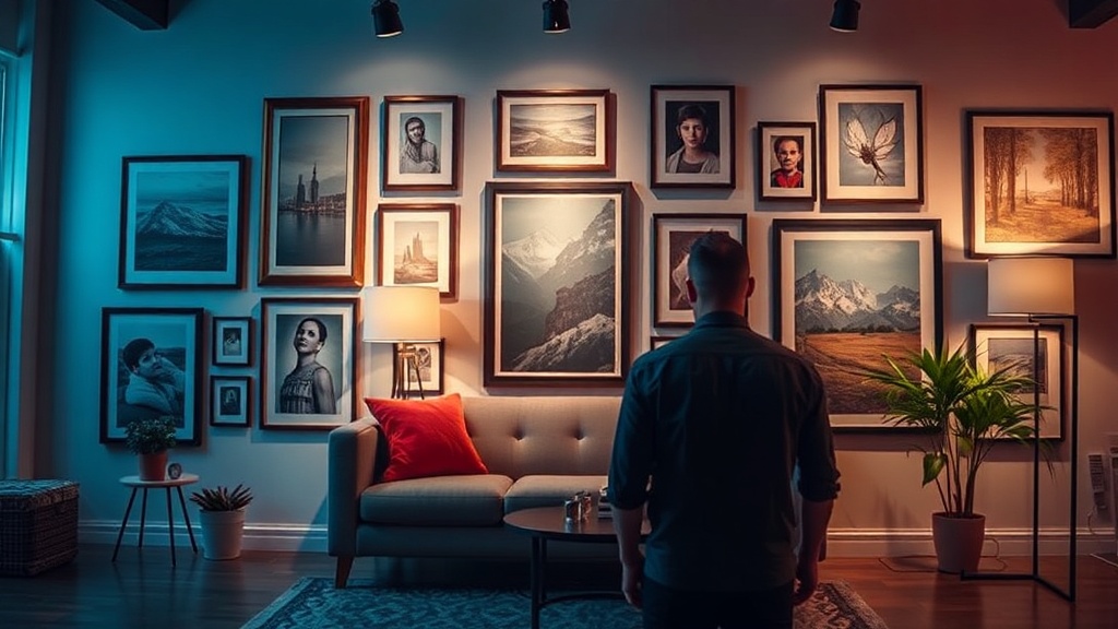
Why You Should Swap Your Basic Wall Art for Gallery Walls

A single, lonely framed print hanging in the center of a large living room wall often creates a sense of emptiness rather than a focal point. This "basic" approach to wall decor—one large piece of mass-produced art—tends to feel static and uninspired. A gallery wall, however, transforms that empty space into a dynamic storytelling tool that adds texture, depth, and personality to your home without requiring a designer's budget. This guide explains why moving away from single-piece decor toward curated collections is a game-changer for your interior design and provides a practical roadmap for building your own.
The Benefits of a Gallery Wall Over Single Art Pieces
The primary reason to choose a gallery wall over a single large piece of art is the ability to mix mediums and scales. A single large canvas is a high-stakes investment; if you get bored with the subject matter or the color, you have to replace the entire thing. A gallery wall allows for much more flexibility and lower entry costs. You can mix a vintage botanical print from a local thrift store with a modern line drawing, a small brass mirror, and a textured textile piece.
Beyond the cost savings, gallery walls solve several common design problems:
- Scale and Proportion: Large, empty walls can make a room feel unfinished. A gallery wall fills the vertical and horizontal space more effectively than a single object.
- Visual Interest: By varying frame styles—such as mixing a sleek black metal frame with a chunky gold ornate frame—you create a sense of curated history rather than a "set" look.
- Personalization: A single piece of art is often a generic purchase. A gallery wall allows you to display meaningful items, like a pressed wildflower from a hike or a vintage postcard from a trip, making the space feel truly yours.
If you find that your furniture feels a bit flat, remember that wall decor works in tandem with your other elements. For example, if you are looking to add more depth to your seating area, you might also consider swapping basic table lamps for sculptural lighting to complement the visual weight of a new gallery wall.
Step 1: Define Your Layout Style
Before you pick up a hammer, you must decide on the "vibe" of your arrangement. There are two main directions you can take: the structured grid or the organic salon style. Both are effective, but they serve different design goals.
The Structured Grid
A grid layout is perfect for a modern, minimalist, or transitional aesthetic. This involves using identical frames and spacing them precisely in rows and columns. This works exceptionally well in dining rooms or entryways where you want to convey order and sophistication. To achieve this, use a level and a measuring tape to ensure every gap is uniform. A 3x3 grid of small, black-framed sketches creates a high-end, architectural look for a very low cost.
The Organic Salon Style
The salon style is more eclectic and relaxed. This is where you mix different frame sizes, shapes, and even 3D objects like small wooden carvings or woven baskets. This style is ideal for living rooms or hallways where you want a cozy, lived-in feel. The key to making an organic gallery wall look intentional rather than messy is to maintain a consistent "anchor" element, such as a specific color palette or a recurring frame material.
Step 2: Source Affordable and Unique Items
The beauty of a gallery wall is that the "art" doesn't have to be a traditional painting. In fact, the most interesting gallery walls use a variety of textures. Since we are working with a budget, skip the expensive art galleries and head to your local Goodwill, Salvation Army, or even the clearance section of a craft store. Look for the following items to add variety:
- Vintage Frames: Look for heavy, ornate wood or gilded frames. Even if the art inside is terrible, the frame is the star. You can easily swap out the old art for a piece of high-quality textured paper or a simple fabric scrap.
- Textiles: A small piece of vintage linen or a hand-woven textile can add much-needed warmth to a room.
- Found Objects: An antique brass key, a vintage clock, or a small ceramic plate can be mounted directly to the wall to add three-dimensional depth.
- Botanicals: Pressed leaves or dried flowers in glass frames are inexpensive to make at home and add a natural, organic element to your walls.
Step 3: The Pro Technique for Installation
The biggest mistake people make is hanging pieces one by one onto the wall. This often leads to a lopsided or uneven arrangement that you can't fix without leaving dozens of holes in your drywall. Instead, follow this professional method to ensure a perfect result the first time.
The Floor Method
Before you touch the wall, clear a space on your floor that is roughly the same size as your intended gallery area. Lay out your frames on the floor and move them around until you are satisfied with the composition. This allows you to see how the pieces interact without any risk. Once you have the perfect layout, take a photo of it from directly above.
The Template Method
For a more precise installation, especially if you are working on a vertical surface, use the paper template method. Trace each frame onto brown kraft paper or even old newspaper. Cut out the shapes and use painter's tape to stick these paper templates onto your wall. This lets you test the spacing and height without making a single hole. If you want to move a piece, you simply move the paper. Once you are happy with the "paper wall," use a nail or a screw to go directly through the paper and into the wall. Once the frame is hung, tear the paper away.
Common Pitfalls to Avoid
Even with a plan, it is easy to fall into a few common design traps. Keep these tips in mind to ensure your gallery wall looks professional:
Ignoring the Eye Level: A common error is hanging a gallery wall too high. The center of your arrangement (or the center of your main grouping) should be roughly 57 to 60 inches from the floor. This is standard eye level in most homes. If you are hanging the gallery above a sofa or a sideboard, ensure there is a 6-to-10-inch gap between the top of the furniture and the bottom of the lowest frame.
Lack of Cohesion: If your gallery wall feels chaotic, it’s likely because there is no "thread" connecting the pieces. You don't need everything to match, but you do need a commonality. This could be a color (e.g., all pieces feature a hint of blue), a material (e..g., all frames are wood), or a theme (e..g., all botanical or all black-and-white photography).
Overcrowding or Under-spacing: If the frames are touching, the wall will look cluttered and heavy. If they are too far apart, the collection will look disjointed. Aim for a consistent gap of 2 to 3 inches between frames for a cohesive look. If you are doing a salon-style wall with much larger pieces, you can increase this gap slightly, but consistency is your best friend.
By moving away from the single-piece approach and embracing the versatility of a gallery wall, you can turn a blank wall into a curated focal point that reflects your personal style. Whether you choose a disciplined grid or a whimsical collection of thrifted finds, the result will be a space that feels intentional, textured, and deeply personal.
Steps
- 1
Gather your art and frames
- 2
Lay out your arrangement on the floor
- 3
Test your spacing with painter's tape
- 4
Hang your largest pieces first
- 5
Fill in the gaps with smaller items