The One Budget Decor Trick That Instantly Makes Any Room Look Expensive

Quick Tip
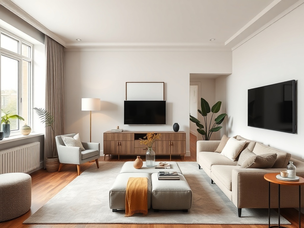
Use a tight 2–3 color palette and repeat it through layered textures and decor to instantly make any room look more expensive.
There’s a reason some rooms feel polished and intentional while others feel unfinished—even when they have similar furniture. It isn’t about spending more. It’s about using one deceptively simple trick that designers rely on constantly: cohesive layering with a controlled color story.
This is not about buying matching sets or repainting your entire home. It’s about choosing a tight palette and repeating it across textures, heights, and surfaces so your space reads as deliberate instead of random. Once you understand how to do this, even the cheapest room can look elevated.
Why Most Budget Rooms Look Incomplete
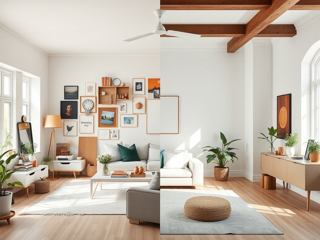
Budget decorating often fails for one reason: everything is chosen in isolation. A lamp here, a rug there, a throw pillow that looked cute online. Individually, these pieces can be great. Together, they clash.
High-end interiors don’t rely on expensive items—they rely on consistency. Designers repeat colors, materials, and shapes so the eye flows naturally through the room. Without that repetition, even expensive furniture can feel chaotic.
The fix is not more stuff. It’s smarter coordination.
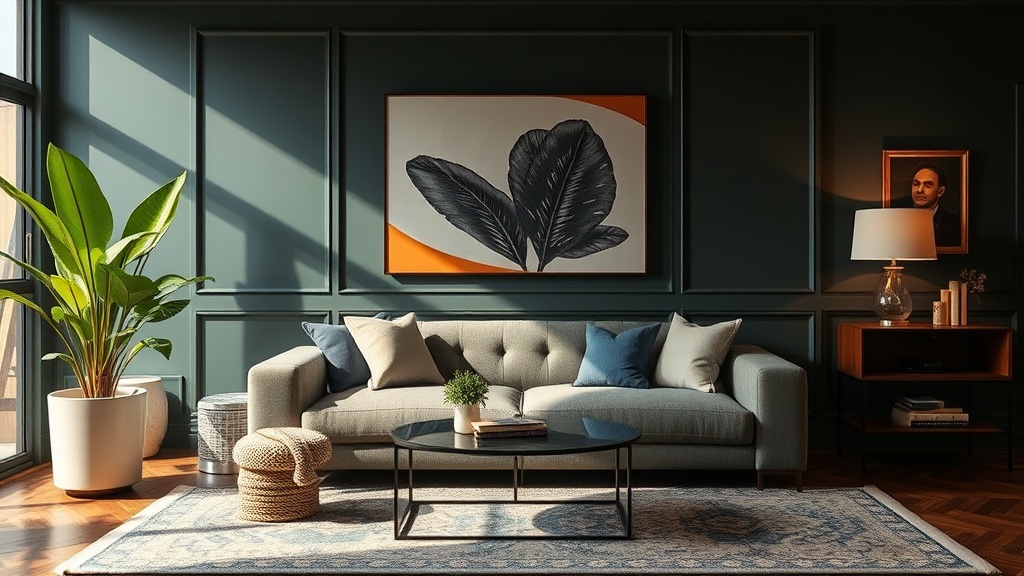
The Core Idea: A Tight Color Story
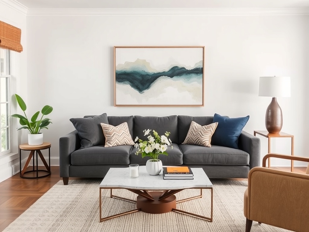
Pick 2–3 main colors and stick to them. That’s it. Everything in the room should connect back to those colors in some way.
- Base color: walls, large furniture (often neutral)
- Secondary color: rugs, curtains, chairs
- Accent color: decor, pillows, art
When these colors repeat in different areas, the room feels intentional. When they don’t, the room feels accidental.
For example, a beige sofa, black metal lamp, and olive green throw pillow can feel disconnected—until you add a rug with beige and green, artwork with black framing, and a blanket that ties it all together.
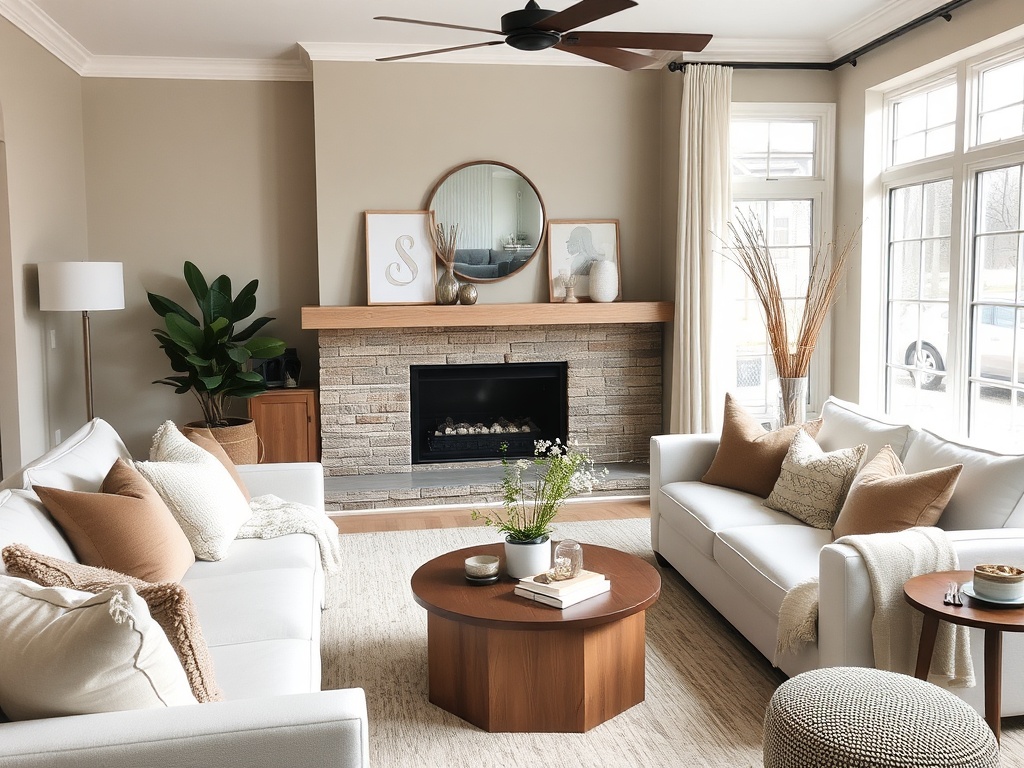
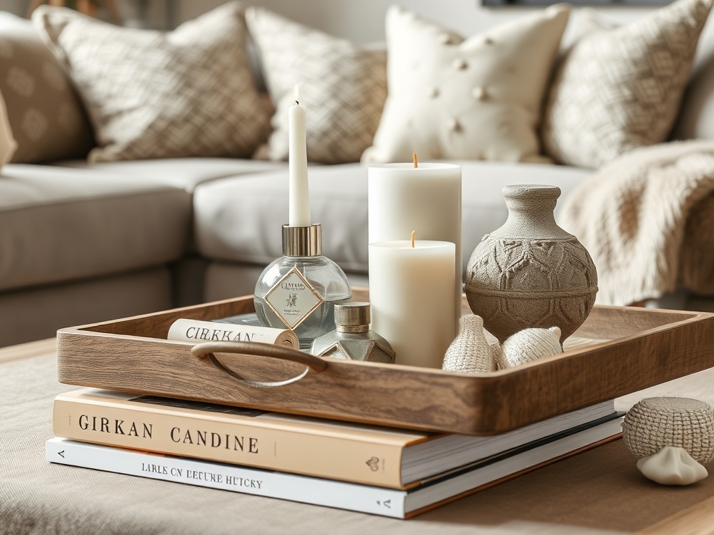
Layering: The Detail That Changes Everything
Once your color story is set, layering is what creates that expensive look. Layering means combining multiple textures and heights within the same palette.
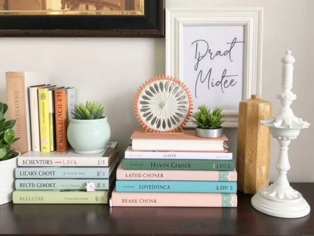
Instead of a single throw pillow, you use two or three with slightly different textures. Instead of one flat surface, you add books, a tray, and a small object.
This creates depth. Depth creates richness. And richness is what people perceive as “expensive.”
- Mix soft (fabric) with hard (metal, wood)
- Combine matte and glossy finishes
- Use varying heights on surfaces (low, medium, tall)
The key is restraint. Everything still ties back to your chosen colors.
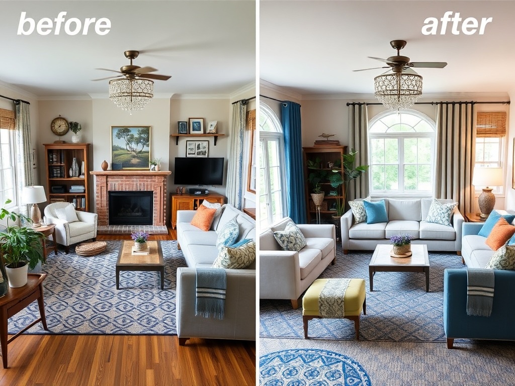
Where to Apply This Trick First
If you try to fix an entire room at once, it gets overwhelming. Start with one focal zone.
1. The Sofa Area
Add layered pillows and a throw that connect to your palette. This is the fastest visible upgrade.
2. The Coffee Table
Use the rule of three: stack books, add a tray, and include one sculptural object.
3. The Wall Behind
Art should echo at least one color already in the room. Frames should match your existing finishes.
Fixing just this one area can make the entire room feel more pulled together.
Budget-Friendly Ways to Pull It Off
You don’t need to buy new furniture. Most of this can be done for under $100.
- Swap pillow covers instead of buying new pillows
- Thrift books and stack them for styling
- Use trays to group small items
- Spray-paint mismatched decor to unify finishes
- Rotate items from other rooms to match your palette
Small adjustments create big visual impact when they follow a consistent plan.
Common Mistakes That Break the Look
Even with a good palette, a few missteps can undo everything.
- Too many colors: More than 3 main tones creates visual noise
- No repetition: A color used once feels random
- Flat surfaces: No layering makes the space feel unfinished
- Mismatched finishes: Too many metals or wood tones without intention
Editing is just as important as adding.
Why This Works (Even in Small Spaces)
This trick works because it reduces visual chaos. Your brain doesn’t have to process competing elements—it sees a clear pattern.
That sense of order is what people associate with luxury interiors. Not price tags. Not brand names. Just visual consistency and thoughtful layering.
Even a tiny apartment can feel elevated when every item looks like it belongs.
One Tip, Real Impact
If you take nothing else from this: stop decorating piece by piece. Start decorating systematically.
Pick your colors. Repeat them. Layer within them. That’s the entire formula.
Once you apply it, you’ll notice something immediately—your space stops looking like a collection of items and starts looking like a designed room.