Can You Really Make Cheap Frames Look Like Custom Art?

You spot them at every estate sale and thrift store—sad, forgotten frames with dusty glass and chipped gold paint, priced at a dollar or two. Most shoppers walk right past them. But here's what I've learned after fifteen years of budget decorating: those neglected frames are secret weapons for creating gallery-worthy walls without the gallery-level price tags. With a few tricks I've picked up—from my interior design training and from watching my mom turn nothing into something—anyone can transform dollar-bin frames into pieces that look like they came from a high-end boutique.
What Makes a Frame Look Expensive (Even When It Isn't)?
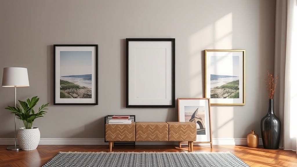
Before we start painting and gluing, let's talk about what separates "cheap" from "custom." Expensive frames share a few DNA traits: substantial width, intentional color or finish choices, and—this one's big—matting. That white border between your art and the frame edge? It's doing heavy lifting. Professional framers know matting creates breathing room and visual weight. Without it, even a beautiful print can look like an afterthought.
Width matters too. Thin frames (under an inch) read as temporary, like something you'd buy at a big-box store for a dorm room. Frames with two-inch profiles or wider feel deliberate and grounded. The good news? Thrift stores are full of wide, chunky wood frames from the 1980s and 90s. They're often solid oak or pressed wood with decent heft—exactly what you want as your starting point.
Look for frames with interesting details: carved edges, beaded trim, or layered molding. These architectural elements catch light and cast tiny shadows that read as craftsmanship. Smooth, flat frames are harder to elevate. When you're digging through the bins, run your fingers along the edges. Texture is your friend.
How Do You Update Dated Frame Finishes?
The frames you find will likely sport finishes that haven't been trendy in decades—shiny brass, orange-y oak, or that peculiar 1990s hunter green. Don't let that stop you. Paint is transformative, but the prep work determines whether your results look professional or DIY-gone-wrong.
Start by removing the backing, glass, and any hardware. Clean the frame thoroughly with a degreasing cleaner (I use dish soap and warm water, then let everything dry completely). If the existing finish is glossy, scuff it lightly with fine-grit sandpaper—just enough to break the surface so paint can grip. You don't need to strip it down to bare wood unless the finish is flaking.
For paint, I've had excellent results with chalk paint and latex enamel. Chalk paint adheres without primer and dries to a matte, velvety finish that feels artisanal. Brands like Annie Sloan pioneered this category, though plenty of budget-friendly alternatives exist. Latex enamel (the kind meant for trim and cabinets) offers durability and a subtle sheen that mimics factory finishes. Expect to pay around $15-20 for a quart—enough for dozens of frames.
Here's a pro trick from my mom: after painting, rub a tiny amount of dark wax or brown shoe polish into the frame's crevices with a soft cloth. Wipe the excess away, and suddenly your flat-colored frame has depth and dimension. It looks aged rather than painted. This technique works particularly well on frames with carved details.
For a modern approach, try color blocking. Paint the outer frame one shade and the inner lip another—cream and charcoal, or sage and white. It reads as intentional design rather than a coat of paint slapped on a thrift find. I've seen this technique in high-end retail frames selling for $80 or more.
Where Do You Find Affordable Matting and Glass?
Here's where budget decorators often get stuck. Custom matting can cost $30-50 per opening—more than the frame itself. But you have options that don't involve a professional framer.
Pre-cut mats in standard sizes (5×7, 8×10, 11×14) are available at craft stores for $3-8. Buy them when they're 50% off—happens monthly at most chains—and stock up on neutral colors: warm white, soft cream, and light gray. These work with almost any art and any frame color. For odd sizes, buy uncut mat board and use a handheld mat cutter ($20-30 investment). The learning curve is shallow; you'll cut clean bevels after three or four practice tries on cardboard.
Glass is trickier. The glass that comes in thrift frames is usually thin, scratched, or missing. Instead of buying new glass (expensive and heavy), consider alternatives. Acrylic glazing—available at hardware stores by the sheet—is lightweight, shatterproof, and cuts easily with a scoring tool. A 18×24 sheet costs around $12 and yields multiple pieces. For small frames, I've used heavyweight page protectors or transparency film. These aren't archival quality, but for casual decor? Perfectly fine.
If your frame came with decent glass but it's cloudy, clean it with a paste of baking soda and water, then polish with newspaper. My grandmother swore by this method, and it works better than most commercial glass cleaners.
What About the Art Inside?
A beautiful frame can't salvage bad art. But "bad" is subjective—and free options abound if you know where to look.
Museums and libraries worldwide offer free downloads of public domain artwork. The Metropolitan Museum's collection alone has over 400,000 high-resolution images available for personal use. Download, print at a local copy shop on decent paper (matte cardstock works beautifully), and you've got art that looks expensive because the original is. Botanical prints, vintage maps, architectural drawings, and abstract works all translate well.
Another approach: frame objects instead of prints. Pressed ferns, interesting fabric scraps, vintage postcards, or even beautiful wrapping paper become gallery pieces when given proper matting and a clean frame. I've framed a $2 vintage handkerchief that gets more compliments than prints I've paid real money for. The texture of fabric or paper adds dimension that flat prints can't match.
Family photographs work too, but print them intentionally. Drugstore prints on glossy paper in plastic frames look cheap because they are cheap. Instead, print on matte or luster paper, size them to leave generous matting (the photo should take up less than 60% of the total framed area), and stick to black-and-white or desaturated color palettes. Suddenly your iPhone snapshots feel like editorial photography.
How Should You Arrange Frames for Maximum Impact?
You've got your collection of transformed frames. Now what? The arrangement matters as much as the frames themselves.
Gallery walls work best with cohesion. Choose frames in a consistent color family—even if the styles vary—or keep frames uniform while varying the art. Mixing wide ornate frames with thin modern ones only works if there's a unifying element (color, subject matter, or matting style). Without that thread, it looks like you hung whatever was lying around.
Spacing is critical. Frames hung too far apart look disconnected; too close and they compete. Two to three inches between frames is the sweet spot for most arrangements. Use paper templates cut to frame size and tape them to the wall before committing with nails. Live with the layout for a day—what looks balanced at 10 AM might feel off-kilter by evening light.
Consider asymmetry. A grid of identical frames reads as organized but safe. A looser arrangement with frames of varying sizes feels collected and personal. Start with your largest piece slightly off-center, then build around it. The rule of thirds applies here just like in photography.
Height matters too. Gallery standard hangs artwork with the center point at 57-60 inches from the floor—roughly average eye level. In rooms where people mostly sit (dining rooms, living rooms), lower that to 48-54 inches so the art engages seated viewers. Above furniture, leave 6-8 inches of breathing room between the frame bottom and furniture top.
The frames hanging on your walls tell a story about what you value. Cheap, mismatched frames with no matting say "temporary" and "afterthought." Frames you've deliberately chosen, finished, and arranged say "curated" and "permanent." The difference isn't money—it's attention. And attention, unlike custom framing, is free.